Recently, I've been in close development with one of my Cognos customers to create a flexible and simple report for analysis of changes in prospect forecasting, called Bridge Analysis. Unfortunately, I cannot share a complete example of this report with you (because of company confidentiality), as this would have a far better look, with logo's, category names and definitions, selected prompt values et cetera. On the other hand, this makes it much better to focus on the heart of the matter.
The Bridge Analysis report, developed in Cognos BI 8v3 Report Studio, contains:
- a Prompt page to select starting snapshot (first pillar or the bridge), ending snapshot (usually the running forecast, as last pillar of the bridge), and various other value prompts for filtering on prospect characteristics
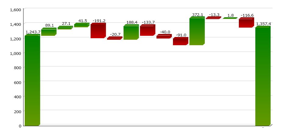
- the Bridge page showing a cumulative column chart (see below) with first and last pillar, and various change categories in between
- a Legend page explaining the used categories containing dynamic descriptions (query items)
- a Page group for all change categories, with one subsequent page displaying a list of top 10 prospect details in descending absolute order of change; the sum of changes in each prospect page totals into the bridge chart category column height, being positive (green) or negative (red)
Bridge Analysis
There are some tricks techniques used in this report:
- The right side pillar is not a regular chart column, but is a Total column, enabled via the chart properties. I've used this on purpose, because a regular column would have to be calculated as a negative value in order to enable movement downwards to zero on the Y-axis. If I had used a regular column to show the right side pillar, this would have resulted in a negative value notation on top of the column, and the column color would have been red. A Total column on the other hand, has it's own color defined (green, as well as the starting column). This rightfully reflects the total prospect values to be analyzed.
- Allthough multiple queries are used, the entire report is using one common prospect details query, delivering all relevant columns in one row per prospect. Other queries are defined on top of this detail query.
- A drill through has been defined in the Change Category column, to show the respective prospect list for the selected category.
- Change categories having no prospect value are excluded from the report, so only relevant categories are displayed in both the bridge chart and in the subsequent categories page group.
My customer is now happy to be able to easily present changed data in this very useful way, and I'm happy to be able to help him creating this powerful and flexible Cognos report :-)